the big. the bad. the MEGA. architecture as a global condition.

10.25.2006

Monday's Presentation

These are some highlights of Monday's presentation. I've posted some of the ideas that the jurors' comments sparked after these images and videos.


  • focus on the populations and their characteristics
  • say something NEW - what are the demographics that are affected by AIDS?
    • income
    • gender
    • age
    • race
    • religion
  • what can this map show about AIDS that is not already known or mapped out? maybe it can be mapped over some other mappings
    • overlaying it with wars (see Katy's map)
    • overlaying it with political unrest/developing countries
    • overlaying it with types of governments - making AIDS political
    • overlaid with weather conditions
    • overlaid with internet usage - Jason's language study
    • overlaid with airports - the travelling of the disease (Steven)
    • overlaying it with McDonalds locations (ha!)
      • could also relate to something like Walmart
      • relation of AIDS to global retail and language

10.16.2006

formZ has AIDS

I enjoyed working this weekend (well, as much as one enjoys working on the weekend) because we congregated at different people's apartments. Sometimes, it's a nice break to get out of the studio building and those uncomfortable stools, and it can be really motivational to just sit in someone's living room and all work really hard. I love how our work/studio is portable. I find it also helps me creatively to be able to change environments. Plus, I am less cranky and more interested in having brainstorming discussions with other members of the group than when I am stuck in Lee Hall.

I also REALLY enjoy this project - I think mapping is an extremely interesting subject - but technological problems are really taking their toll on my patience. So I spent the weekend struggling with formZ's error dialogues, and I have a lot of questions regarding simply forming the shapes I want. I must be a little rusty on all of this. The latest animation is also a little jumpy and I haven't quite figured out why. It gets the point across for now, though.

I am reposting the animation from last Friday, so you can compare it to today's animation right below it. I attempted to take Friday's idea and make it 3-dimensional. The height of the African land mass in this animation represents a population - the most populated areas being the highest, and AIDS cutting into the population.

Friday's 2-D animation:


Today's animation:


This animation was produced from a series of displaced surfaces using the following images. The lighest portions are the highest (and therefore most populated) areas of the land mass, and as you can see, this is a 2-dimensional representation of the infestation of AIDS.


10.13.2006

the new Black Plague

A brief return to 2-dimensional explores what it actually MEANS when a land is infected by AIDS. Does the clean, uninfected world remain as is, and the infected world become cast over by a shadow? Does the uninfected world turn a blind eye on the populations with AIDS?

The world turns its back on AIDS, as if people with AIDS disappear.
AIDS "eating" the world up until about 1993 (except for South America data).


AIDS nations shown without regard to actual land masses.


Another idea I am going to explore before Monday involves viewing the world as a series of populations, because AIDS affects populations, not land. I believe it will also make a more visually accurate mapping, because in places where AIDS has spread slower, there is also a lower population density, so showing the spread of the infection as shown above is somewhat misleading.

More on this to come Monday, which is why I requested to wait to have a desk crit, so I can get all my ideas constructed...since it took me constructing the above animations to come up with a better way. I need to move forward on my own a little, and still reflect on which type of map would best represent my data. I am struggling to understand what the types of maps even mean.

research...
I found this video of an AIDS cell attacking a cell in the brain. I thought it would be interesting, visually, to animate the spheres in these study animations as cells attacking the populations.

10.11.2006

AWKWARD!


I'm getting there - trying to work on not tracing. The latest animation shows factoring in the growth and numbers of AIDS-infected population. It does not take into account the ways in which AIDS was contracted, but the information is available, and I thought about mapping that through color differences, maybe.


Another idea I had was to have, after the spread of the disease is shown, the places where treatment is available (and how much of it is available in relation to the population). Therefore, maybe the difference between infected population and treatment availability could be mapped - showing the areas where treatment is in high demand.

If you compare the previous animation with the most recent animation, my idea is that these spheres leap from land to land, "infecting" it and spreading, as AIDS does to the human body. The land masses are supposed to be transparent (though it is hard to tell in these studies), so you can see AIDS "infecting" the land. I am having A LOT of trouble making the tools do things smoothly. The morph tool tends to make objects that seem like they should be simple, turn some of them into surface objects, etc (which is what happened in my animation for today).

10.09.2006

Animation Creation

Have started to try to plug my legitimate data into some sort of animation scheme, because I thought it was counter-productive to fool around with animations anymore, because I think I have a good basic understanding of how to do them.

Here is my animation from Wednesday.

Here are the beginnings of an animation with accurate data.


Thoughts on Breeze...
-The only thing I like about it is the file sharing and desktop sharing. I'm really not a fan of how the vocal communication works. Maybe it would be beneficial to speak through Skype while doing things through Breeze, too?

10.06.2006

Next animation attempt

Next attempt...sort of successful. Still can't get lighting to work, and just a matter of figuring out how to edit views. I want to be able to control the amount of time there is between view keyframes but I can't seem to do it.

Also, the shapes aren't at all looking nice how I want them to...but I guess you get the gist of it.

AIDS "jumping" to the US from Africa (1959)

10.04.2006

PANDEMIC II: the global spread of frustration with formZ animation

I've been messing around with formZ animations for the past couple days, and here's what I've done as far as experimenting with animations.

First attempt - showing a form growing across a map - used the morph tool.
Second attempt - experimenting with methods of animation, including:
  • changing colors
  • animating entities
  • animating along a path
  • morphing
  • having one object do many things at once
  • controlling more than one object at once
I attempted to control lights, but I had a problem where the light I was animating (and I tried it by both animating entities and simply moving the light) simply would not remain "on" while the animation was going.

10.02.2006

Sea and Sky and everything in between

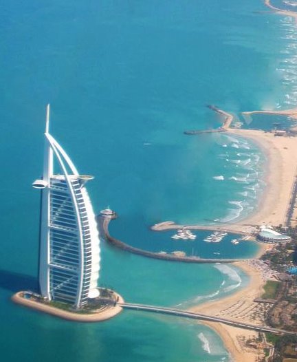
At the moment, it is the largest standing hotel in the world. Dubai's Burj al-Arab Tower Hotel was built to be an icon; the oil-rich government of the United Arab Emirates hired South African architect Tom Wills-Wright to create a "Sydney Opera House for Dubai," something that would immediately say "Dubai" in the mind of someone who saw the magnificent skyscraper.

Modelled after a sail, it is highly structured in defense against the intense sea winds with a three-part exoskeleton. It is a lightly massive structure that appears to be floating on water - dangling off the coast by a mere miniscule land bridge. It is like a boat tied up, a boat that reaches to the sky and remains anchored.

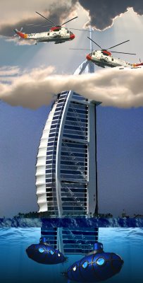
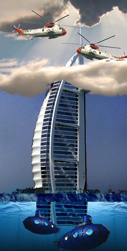
To me, the most unique aspect of it is the fact that it has a helipad on its roof (alongside a tennis court and other "necessary" things) and a restaurant under it, which is accessible only by submarine. The entire hotel is also separated from the land. It is an island, essentially - a skyscraper island built high with dwellings. It reaches high to the airborn population with its helipad, and sinks below the water with its restaurant. It stands as a tall structure that touches all modes of transportation and levels of Earthly existence. These three "layers" of society are reached entirely by this one structure, but as it rests on the water.

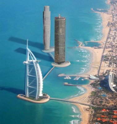
I move on to ask this question: what happens when we have entire cities suspended off of a coast? Is this element of seclusion that the hotel already offers, which appeals to the wealthy vacationers, something that is desirable for people, whether vacationing or not?

Conceptually, in section the important part of this hotel is that it reaches these earthly elements of water, land, and air, enabling three different methods of transportation to reach the building. Otherwise, it is the fact that it is located so far off the shore and floating on the water - isolated from the city yet still connected through a spectacular view of the city, from the tennis courts atop or the rooms within.

sources:
Great Buildings of the World, Time. p. 128
Emporis Buildings (images and information)

both illustrations are original.

10.01.2006

PANDEMIC: the spread of AIDS

pan·dem·ic (păn-dĕm'ĭk) n. Epidemic over a wide geographic area.

BACKGROUND
AIDS
(Acquired Immune Deficiency Syndrome), caused by the HIV virus, is theorized to have originated in the species of chimpanzee known as the sooty mangabey, which mainly inhabit the region of Guinea-Bissau. In 1959, the two earliest known cases were recorded - the first one in the Belgian Congo, and the second in Manhattan. Cases were very sporadically diagnosed, steadily increasing in number and location over the next 25 years, adn then had a spike in the 1980s. Originally thought to have been related to homosexual sex, it was called GRID (Gay-Related Immune Deficiency) until 1982, when it was decided that the number of cases found in heterosexual women disproved that theory. Today, there are anywhere from 33.4 million - 46.0 million people living with the HIV virus.

The data available contains some level of error. Before the late 1980s, doctors were not educated on the symptoms of AIDS and it was still thought to be new to the United States. For these reasons, diagnoses were rare and the disease was still not widespread. Later on, scientists examined remains of people who had died of similar symptoms in the 1960s and 1970s, and found that as a general rule, AIDS was not widespread and these people had not been misdiagnosed in their lifetimes. Therefore, scientists and doctors believe that the sudden growth of AIDS in the 1980s was not due to a raised awareness in the medical field, but does serve as a fairly accurate judge of the spread of the actual disease.

(click for larger view)

APPROACH
As you can see from the images displayed, I am working on compiling the data of the simple area spread of the disease, and I will show that in one or a series of flash animations. What will occur three-dimensionally will be done in FormZ, and that will include the data of population infected numbers in regions. The reason is that I want to show simply the spread of infection across the continents without regards to population statistics. The
three-dimensional map will show the problem areas, areas where the disease has most successfully infiltrated the population.
(click images for a larger view)


PURPOSE
I believe that this data can be useful conceptually as a visual display of the disease's spread across the globe. AIDS, like global warming and radiation, spreads rapidly and widely, being passed from person to person. I will express the areas of the Earth in which the disease is present during given periods of its development and spread, and I will also express the differences in population infection. The mappings will display the fact that the area where AIDS is the most prevalent is sub-Saharan Africa and least prevalent is Southeast Asia, for example. I hope that these mappings could give a good visual of exactly what it means for the world to be at the mercy of a pandemic, and a graphic understanding of the parts of the world that need help the most.