In my first presentation, I examine the statistical effects of AIDS on the general population. Now, I am setting this opposed to the availability of treatments for the infection.
GlaxoSmithKline (GSK) is the only drug company in the world to produce the chemical compounds that make up the composition of every brand of medicine used to treat AIDS. The most significant of these compounds are lamiduvine and zidovudine.

This series of mappings (generated by statistics as of 2005) aims to examine the AIDS pandemic as it infects world populations, and to compare it to the amount, availability, and location of these drugs produced by GSK. The following four mappings follow the key provided to the right. Any images can be clicked for a larger view.
reduction of the population
according to AIDS infections

GSK's manufacturing plants and the
percentages of treatment received by areas,
as an addition to the population.
The blue areas designate where more than 10% of the infected population
is able to receive treatment.

examining the GSK network only.
Make note of the locations of manufacturing plants
versus the areas of significantly treated populations.

When you examine each of these mappings under a real-world road map, you can see (something probably already obvious) that the more developed areas have more manufacturing plants. However, it is interesting to point out that while they may have more manufacturing plants, they don't necessarily have a higher treatment availability. In some cases, such as in Jamaica, treatment is manufactured but sold to other places, and the AIDS patients indigenous to Jamaica aren't receiving the treatment they need.

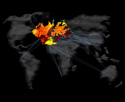
The following maps represent a rearrangement of population - the population that is treated for AIDS. It is referred to as the "GSK empire" and its manufacturing plants which are in the same scenario as the one in Jamaica are excluded from this megaContinent. It is placed opposed to the total untreated AIDS victims of the world, represented as negative land masses. The continent is composed of the treatment areas, arranged on top of each other according to the cities from which they receive the treatments. Take special notice of the manufacturing plants located outside of the continent but which fully contribute to supporting the megaContinent.
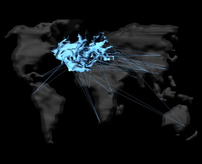

Here, the real-world map has been super-imposed on the megaContinent, showing the joining and connection of the most populated areas in the world.
 solar heat absorption as a treated megaContinent

GSK's manufacturing plants and the
percentages of treatment received by areas,
as an addition to the population.
The blue areas designate where more than 10% of the infected population
is able to receive treatment.

examining the GSK network only.
Make note of the locations of manufacturing plants
versus the areas of significantly treated populations.

When you examine each of these mappings under a real-world road map, you can see (something probably already obvious) that the more developed areas have more manufacturing plants. However, it is interesting to point out that while they may have more manufacturing plants, they don't necessarily have a higher treatment availability. In some cases, such as in Jamaica, treatment is manufactured but sold to other places, and the AIDS patients indigenous to Jamaica aren't receiving the treatment they need.
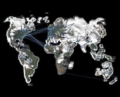
a satellite photo of the Earth superimposed
upon the treated population
upon the treated population
receive treatment
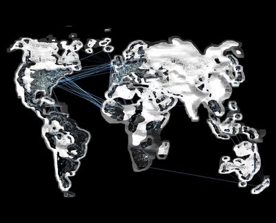
superimposed upon the treated population

The following maps represent a rearrangement of population - the population that is treated for AIDS. It is referred to as the "GSK empire" and its manufacturing plants which are in the same scenario as the one in Jamaica are excluded from this megaContinent. It is placed opposed to the total untreated AIDS victims of the world, represented as negative land masses. The continent is composed of the treatment areas, arranged on top of each other according to the cities from which they receive the treatments. Take special notice of the manufacturing plants located outside of the continent but which fully contribute to supporting the megaContinent.


Here, the real-world map has been super-imposed on the megaContinent, showing the joining and connection of the most populated areas in the world.
the "world at night" as a treated megaContinent
 solar heat absorption as a treated megaContinent
The next step, is to break apart this mass of healthcare and develop a means to transport these important drugs to the most remote corners of the Earth - the crisis areas that need them the most. Perhaps it can be a network with a series of travelling units containing these drugs, much like Archigram's Plug-In City proposes. The goal must be to break the megaContinent into small, functional, moveable pieces - components of a megaHealthcare facility that spreads the research and innovation of the developed world to the isolated ends of the globe.


2 comments:
melissa,
i have reviewed your post. i think you have made big leaps from your last posts. i feel you might want to link to some of your previous work to reinforce and offer background to this research.
Hi Melissa:
I'm looking at your animations and maps and I'm going to try to comment in a coherent way but excuse me if I have a lot of different things to say about different drawings and I get a little out of order...>
1. I think you've choosen a good theme for your mapping. It's important and what you propose has the potential to change the world in a good way!
2. I think I understand that you are focusing on areas of land where the population does not have access to drugs, where the drugs are made, and where aids is the most prevelant. Those are your three most important "zone" and the connections between them...
VA
Post a Comment