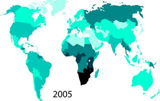
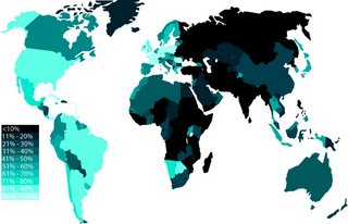
These two maps show (first) the prevalence of AIDS in 2005 and (second) the percentage of AIDS populations reached by treatment. The lighter areas in the first map indicate a higher percentage of AIDS prevalence, and the lighter areas in the second map indicate a higher percentage of treatment coverage.


No comments:
Post a Comment