I also REALLY enjoy this project - I think mapping is an extremely interesting subject - but technological problems are really taking their toll on my patience. So I spent the weekend struggling with formZ's error dialogues, and I have a lot of questions regarding simply forming the shapes I want. I must be a little rusty on all of this. The latest animation is also a little jumpy and I haven't quite figured out why. It gets the point across for now, though.
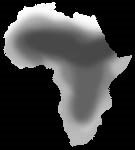
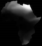
I am reposting the animation from last Friday, so you can compare it to today's animation right below it. I attempted to take Friday's idea and make it 3-dimensional. The height of the African land mass in this animation represents a population - the most populated areas being the highest, and AIDS cutting into the population.
Friday's 2-D animation:
Today's animation:
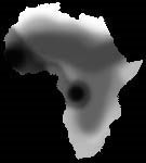
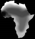
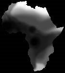
This animation was produced from a series of displaced surfaces using the following images. The lighest portions are the highest (and therefore most populated) areas of the land mass, and as you can see, this is a 2-dimensional representation of the infestation of AIDS.


3 comments:
3. All of these black and white drawings and animations are very clear and easy to understand. They really work a little bit better than the later mappings that have 3 dimensions.
4. What happend to your idea to map the aids epidemic on top of the population density? I don't think I see that one here. That could be very valuable.
5. Choosing the "right" other maps over which you lay your aids map could make a big difference in how you proceed with the project. For example, I think you should lay it over a population density map. A map that shows wealth or GNP, maybe a geographic map. Land formations, poverty etc. could all be things that are preventing certain people from getting the needed drugs and you could potentially identify these obstructions in your mapping. I'm not sure what a solor radiation overlay does for you - but I think perhaps a rail or highway or air traffic map could be very useful.
VA
...please where can I buy a unicorn?
con usted no soy conforme http://nuevascarreras.com/cialis/ cialis 20 mg precio Meravigliosa, molto prezioso risposta cialis dosis recomendada uahcvtqjjn [url=http://www.mister-wong.es/user/COMPRARCIALIS/comprar-viagra/]cialis online[/url]
Post a Comment